Zebeth Media Solutions

Articles

How to Design the Ideal Hero Image for Your Online Portfolio

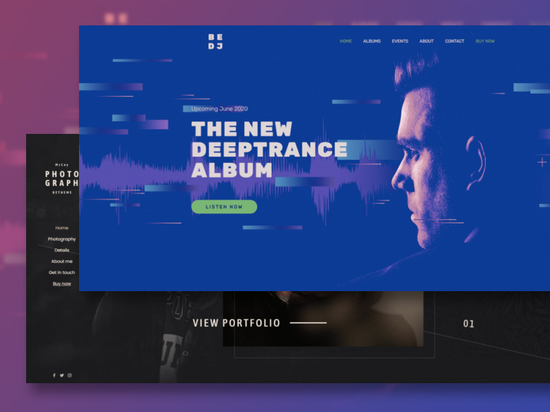
It doesn’t take long for visitors to form their initial (and occasionally lasting) opinion of a website. When you stop to consider that the hero image on a website’s home page is they first thing they’ll encounter, it should be rather obvious that if the image isn’t particularly interesting, their expectations may not be high. The message is this: You need to take time to ensure your hero image is well planned and properly implemented. It’s mandatory to give visitors the impression that you are creative, talented, and have made it worthwhile for them to have a further look. How do you go about making the ideal image for your online portfolio?  We will show you how by focusing on 6 elements accompanied by some of the 100+ prebuilt portfolio websites that come with BeTheme, and other brands that illustrate various paths of bringing everything together. Designing an excellent hero image for your portfolio  These 6 elements involve – Picking a hero image that directly connects with the nature of your workUsing a supportive image backgroundChoosing an appropriate font schemeSelecting an appropriate color schemeUsing interactions to liven up the hero imageSpecifying or implying a call-to-action to the next step There are various ways to artfully bring these 6 elements together. In this post, we’ll look more deeply into each element and provide example of each that will help you incorporate all of them into a hero image designed to engage even the most skeptical visitor. Let’s get started. 1. Select imagery that directly connects with the nature of your work Your choice of imagery for your hero image must clearly relate to the material in your portfolio. Interior design boutique Lauren Waldorf Interiors’ hero image features a sliding gallery of finished projects: Photographers, videographers, web designers, and visual artists could well find this approach attractive.  You may need to adopt a different strategy if your work involves visual representations of media that are potentially challenging, such as having your face the main image in your hero section, as shown in the BeDJ 2 hero image: If you’re a DJ for example, the image of your face connects you, a real person, to the work you do. It is also a more powerful approach than a colorful bunch of graphics relating to music. Whatever approach you take, you need to carefully consider: Who or what will the main subject of the hero section be?Should a picture be in the background or the foreground?Should an image be untouched or altered to make it appear more artistic? A fourth possibility is that you might not need imagery at all, and simply let the text do the talking! 2. Use the background to add more information about your work. There are several different approaches you can take when selecting the background for your hero section. For example: The background could be devoted to the work you are doing.It could provide a small “tease” as to what a visitor will experience.It could identify your work using a graphical or abstract approach. A video or slideshow could be used to give a brief preview of your work, an approach that would also serve to give your website a lively feel. This example from the BeInterior 6 pre built website demonstrates how your hero section could be used to give visitors a small tease of what your work is all about. While the photo gallery takes up less than a quarter of the hero image, it gets the job done, plus it offers a creative way to provide additional context as to what the visitor can expect. With respect to the backdrop, a textured photo like the above or a comforting color scheme could be used advantageously. Using solid colors or gradients the way that Mindgrub has done is yet another effective approach: This could be a great option for digital creatives, instead of using screenshots of products, why not build a digital gem of your own to engage your audience? If you’re building a website for a client, this approach gives you an opportunity to put your design creativity on full display. 3. Style your fonts with clarity in mind. You are not going to attract a lot of people to view your state-of-the-art product line if you elect to go with a gothic font. That’s a ludicrous example of course, but your choice of a font or fonts can have an impact. Aesthetics matter; sometimes as much as the words themselves. The font type you use is one way to add a voice to your hero messaging. BeDetailing 4 pre-built website, for example, uses a Google font called Italiana:  This auto detailing company expresses its fondness for classic and vintage cars up front. While the wording and imaging says as much, the elegant, calligraphy-inspired font caps it off. The styling of your sentences can also have a bearing on the way your messaging comes across. The Get Em Tiger site does several things to change the way their hero image text is interpreted inside the heads of those reading it.  The headline in all caps is usually interpreted as sounding loud or bold inside the head. STAND OUT, in orange, does precisely that. It creates emphasis the same way that bolding or italics normally does, but even more so here. The sentence making up the sub-headline brings the temperature back down a bit inside the head by creating a friendlier, more conversational tone. 4. Work out the job the colors scheme will perform. When the time comes to settle on a color palette for your hero section, you will probably already know what your brand colors are and have worked out a color scheme to use for styling buttons and accents throughout your website. You could also use your brand colors when creating your hero section as G Sharp Design has done in the following example: The color palette in this hero section is simple and straightforward, yet it is particularly eye-catching and engaging.

How to Make Search Your Site’s Greatest Asset

What makes a site truly brilliant? Impressive content? Sophisticated design? User-friendly interface? An effective support system for users, old and new alike? All this and more, my friend. No matter what you choose to build your site around, it can’t exist without a great search solution that helps guide every visitor to what they’re looking for – quickly, efficiently, and with as little effort on the site owner’s part as possible. In this article, we’ll go through the crème de la crème of the coolest features you can implement on your search with the help of Site Search 360, an easy-to-install and easier-to-maintain app fit for any site builder. Whether you have a HubSpot blog, a knowledge base maintained via Zendesk, a Shopify store, or all three at once, as long as your site’s content is searchable, this app is just what the doctor ordered! Top 5 search features for your site Search Result Categorization It’s highly likely that your site has tons of content that your users might be asked to search through. Depending on the number of pages you have accumulated over the years, that could require herculean patience. So, the first thing needed for your new search are separate tabs to neatly organize all the types of content you offer. Say you sell a million types of products. You wouldn’t want your users to scroll through all product categories mixed together as they search for their dream pair of shoes. Non-commercial sites can use this nifty technique, too – for instance, to put articles, YouTube videos, and blog posts in their own dedicated tabs. Or, as we call them in the search biz, Result Groups. Categorization via Result Groups is by no means limited to good old content types. Your search results might constitute pages from more than just a singular site – you could, for instance, have several interconnected domains for your primary content, FAQ knowledge base, news, etc. All of them have unique subsets of pages that you’d need your users to be able to search through, and as long as all these sites are included in your Data Sources, you can not only enable extensive cross-domain search, but also separate pages from these sites into dedicated groups for easier navigation. And the best part? You can even manually order these tabs to guide your site visitors to the categories you deem most important. So, how do you set this up? Easy – just enter the URL patterns of the page subsets you’d like to include in the same tab (or XPaths to specific elements found across all of these pages), give your brand-new Result Group a name, and you’re done: Repeat until all categories are in place. And here’s what your Result Groups can look like once implemented: Pro tip: If you ever feel like adding multiple search boxes to your site, you can limit each of them to specific Result Groups. You’ll then have, say, only products in the search results for the commercial part of the site, FAQ entries on the “About Us” page, etc. Configuration options are close to infinite! Filters and Ranking Your search is now organized into tabs. But that’s not the only thing you can do to make navigating your site’s content a piece of cake. Filters are a must-have when you want your users to be able to narrow down their search to instantly find exactly what they had in mind. Say someone’s looking for articles written by a specific author within a specific date range. With just a few clicks, you can create filters for both of these criteria (or anything in the world really – from prices to locations and beyond). These bad boys are configured differently for projects whose search results were generated either with a sitemap or through website crawling (low-touch integrations where the only thing we need to index your content is your site domain) and for those where a product feed was involved, turning each product into its own search result (best integrated over our API or through our extensions for various e-commerce platforms such as Shopify, Shopware, Adobe Commerce, and so on). For crawler-based integrations, filters are configured with Data Points, tidbits of information found across numerous pages that the crawler is pointed to via XPaths, URL patterns, linked and meta data, or even regular expressions. Data Points can be added to search result descriptions (across all pages as well as in specific Result Groups), used to automatically boost certain pages in your search results’ hierarchy, and, of course, they can direct the crawler to your future filter values. All of this can be configured right when a Data Point is created with a simple tick in the box of your choice. Here are the settings you can tinker with for each of your filters: And here’s your data point used simultaneously in the description of the product and as a filter: For e-com, things get even more exciting. Instead of Data Points, we extract and then use Product Facts, aka the various product characteristics (like color, material, vendor, etc.) available in your feed. The process is fully automated – no need to experiment with XPaths and regexes. It also comes with some ecom-exclusive perks such as HEX-coded circles next to “Color” filter values. An e-com filter configuration could look like this: Another pro tip for you: e-com and regular filters alike (as well as their values) can be reordered, and there’s even an option to exclude specific values from any filter. But the coolest part is that you get to choose how many pages should bear the values of a specific filter before that filter is triggered to pop up in the search. There really isn’t much of a point in showing the filter if it can only be applied to a singular page, now is there? In action, these filters are impressive to say the least. Filters are tightly connected to Ranking Strategies. Crawler-based integrations come with the option to sort results in ascending or descending order by any numeric Data Point such as “Price”. Sorting Options are configured in a very

Why Do WordPress Themes Have to Be So Hard to Use on the Backend? (Hint: They Don’t!)

Whether you’ve designed websites with only a small handful of WordPress themes or have used dozens of them over the years, we can all agree on one thing: Many WordPress themes that are visually stunning on the frontend of a website end up being ugly as sin and difficult to use on the backend. Why does it have to be that way? It doesn’t. If a WordPress theme looks and feels great on the frontend, there’s no reason why its backend doesn’t as well. BeTheme is proof of this. BeTheme is one of the top 5 best-selling WordPress themes of all time, with more than 260,000 sales and a 4.83-star user rating. In this post, we’re going to show you some of the ways in which this WordPress theme backend is going to make your life easier as a web designer. Upgrade your workflow with a WordPress theme backend that doesn’t suck After you install BeTheme, you’re going to notice something is different. Gone is the drab and oftentimes cluttered and unintuitive backend of WordPress. In its place, you’ll find a clean, attractive, and useful theme dashboard and tools. Don’t worry. WordPress and all of its content management tools are still there. But when you’re inside of BeTheme, you’ll find yourself in a space that is at once visually appealing and so easy to use you’ll wonder why the rest of WordPress isn’t built this way. If you haven’t been inside of BeTheme before (or even lately), join us as we walk through some of its best and most useful backend features: 1. Dashboard design Your BeTheme dashboard will appear directly under the main WordPress Dashboard link. So there’s no need to sift through the sidebar trying to figure out where your theme settings are. It’s not just convenient access that makes the BeTheme dashboard great. Click on BeTheme or the Dashboard link and you’ll discover: Navigation bar that takes you to the most commonly used BeTheme toolsStatus and plugin updatesStep-by-step website creatorNew feature announcementsLatest pre-built websitesTheme registration informationPopular BeTheme integrations Everything in the dashboard is here for the express purpose of helping you get more out of your WordPress theme. Whether it’s streamlining your website setup or discovering new features to use, the dashboard is there to help. 2. Dark/light mode The research on dark mode and the benefits associated with it is inconclusive. That said, enough people have shown a preference for dark mode (which is why popular devices and apps offer the option now), so it could demonstrate big benefits on an individual basis. The most common benefits that users report are reduced eye strain, better sleep, and longer lasting device batteries when using dark mode. As a web designer, you’re working in front of a computer screen all day. If you find dark mode to be beneficial for any of these reasons, then you should find yourself a WordPress theme backend like BeTheme’s that enables you to toggle on dark mode. 3. Step-by-step website creator When you first install a WordPress theme, it’s not always clear where you should go next. For instance, you know that your theme comes with demos, but where do you go to find them? Some themes bury their demos or pre-built websites inside their settings panel, so it can take some digging around. BeTheme removes all the guesswork. You’ll find the Setup Wizard under BeTheme as well as in the dashboard. Click on it and the step-by-step website creator will help you: Name your website.Choose your preferred editing mode.Select a page builder to work in.Pick the perfect pre-built website for your industry/niche.Remove existing content and replace it with your new site. This whole process takes less than 30 seconds to complete — from the moment you click the setup wizard button to the time it takes to load your new site and page builder into WordPress. 4. Pre-built site previews BeTheme has over 650 pre-built websites, with new ones being added to the collection all the time. You’ll find them under the Websites link in the dashboard or under Pre-built websites under the BeTheme sidebar menu. As a web designer, you’ll quickly become acquainted with the options that are available — and you may even find favorites you prefer to start with. That said, you want to make sure you’re always designing websites using the latest and greatest design trends and styles. Because of this, BeTheme places previews of its newest pre-built sites in your dashboard. Having the newest themes front and center will be useful in a number of ways. For starters, you’ll know when you have new sites to design with. Even if you choose not to use those sites (because you already have one you like, for instance), seeing the latest styles and features will be a good source of inspiration. Either way, this will enable you to utilize the latest design trends in your website designs going forward. 5. Plugin manager The Plugins area of BeTheme isn’t the same thing as the Plugins area in WordPress. While there is some overlap, the purpose of the BeTheme plugins manager is to give you a place to: View your actively installed plugins.Update plugins that need it.Install and activate recommended plugins for your pre-built website only when you need them. It’s the last point that’s important to take note of. You won’t see any of these plugins in the WordPress plugins manager until you’ve installed them. These recommendations come directly from BeTheme and can help you get more out of your theme and pre-built site. On the flipside of that, not installing them can also help you cut back on unnecessary plugins which will allow you to keep website performance high. 6. BeTheme support WordPress might be the most powerful and popular content management system in the world. However, it’s a mostly community-driven platform when it comes to themes, plugins, and even providing support. You shouldn’t have to dig through forum after forum on the WordPress.org website to find

How to Help Your Creator Clients Monetize Their Content with a WordPress Membership Site 

With the boom of the creator economy, there’s no doubt that independent publishers, content creators and entrepreneurs are looking for ways to monetize their passion. One way to help these creators achieve sustainable and reliable recurring revenue is by implementing a membership business. However, oftentimes, these creators need help to build out their site’s functionality, gate their content, and implement the membership program. That’s where you (and we!) come in. Memberful is a powerful, yet easy, way to create a paid membership business on WordPress websites. When you combine the protection capabilities of our WordPress plugin with a beautifully designed WordPress site, the outcome is an unmatched membership experience. Getting started and creating Plans Sign up at memberful.com and install the Memberful WP plugin on your client’s site. You can try Memberful for free in test mode for as long as you need. A membership Plan is defined by specific price point and frequency of renewal, such as $6/month, as well as subscription length (a defined time or until a member cancels). Sign up for Memberful Memberful’s settings allow you to enable taxes, free (or paid) trials, upgrades and downgrades, and which content is included such as podcasts or downloads. You can also specify which page or post you want your client’s members to see when they finish logging in or signing up. Restrict access to members-only content There are two ways to restrict access to private content: the Restrict access meta box found in every page and post (or custom post type), or the Bulk editor that allows you to restrict content by category or tag. You can choose who can access each page or post: All members — active, inactive, or free (this works well for a “Freemium” tier)Members with an active subscriptionAnybody who owns a specific download If your creator client would like to display the beginning of their post and then fade out with a lock-type image, as seen in many well-known publications, you can use our Global marketing content setting. Teaser text Memberful will pull the first two paragraphs from any protected posts to use as teaser content for non-members or logged out members. Ready to launch? You can use your Memberful account in test mode for as long as you like. This means you can use Stripe’s test credit cards to complete dummy member purchases and recreate the onboarding experience. When you and your client are ready to start processing real orders, connect Memberful to their Stripe account. We will reset the dashboard member metrics, but your settings and customizations will be maintained. Now your creator client is ready to start selling memberships! Encourage them to announce the membership on their social media and to send an email newsletter to their community to spread the message far and wide. Menu to Grid Layout Animation How to Recreate Stripe’s Lava Lamp Gradient with Three.js

Effortless JavaScript Image Editing With Pintura

I’m a web developer for more than 10 years now, and I know how hard it would be to work on more serious projects without using third-party libraries. This is why I love them so much, and in this article, I’m going to share one of my recent findings. A gem that I deem very helpful for profile photos on a website such as a forum or LMS (learning management system), although this plugin is so much more. It’s a paid JS plugin, but for a very good reason. Let’s see how we can save a ton of time in the development process by using this neat image editor, compatible with most of the development stacks out there. What is Pintura? Pintura is an image editing tool, packed with so many great features that I don’t know where to start first. In fact, the scope of this article simply can’t hold the number of possibilities that this plugin provides, so I’ll try focusing briefly on the main features and showing some quick examples. In a nutshell, Pintura is a robust JS image editor, allowing you to crop, resize, rotate, apply filters, or fine-tune your images. Pintura also supports annotation, stickers (including custom ones), removal of sensitive information from the photos (such as location), enforced crop ratio, and others. It is responsive and works on both desktops and mobiles, very lightweight and fast to use. And while you as a website owner can use it for your own website or project, this tool is perfect for developers. Yes, this library is self-sufficient and can be used on your website as an image editor (check this website for example), but the real power comes in accessibility for developers and the support for a wide range of development platforms. Should you try Pintura for your own project? While I always encourage fellow devs to shake their heads and make the best of any tool they are trying to build, certain things are best when implemented. I mean, if you want to build your own image editor tool, you can do that, but it can take months, especially if you need more than 1-2 features that Pintura provides. Plus, you need to test on different devices and cover a wide range of use cases, which basically takes a solid team and a solid amount of time. But what if you’re a solo rider? Or if your team is working on a large-scale project, yet you want or need to make it better when it comes to image processing? This is where Pintura comes in really handy. The pool of use cases is rather deep, but you can think of it like this: When you need a photo fitting certain criteria in your project, Pintura makes it effortless. Profile photos in a certain size or ratio, filtered and styled featured images, equal images for slides, galleries, or carousels, and a website where you can strip all the privacy information from a photo… are just some of the many possibilities. So, although someone with no coding experience can use it, Pintura shows real strength when used by developers. It saves time and provides an elegant solution for image editing on the fly, whether automatically in the code or by allowing website users to fulfill a certain requirement or just make their photos more appealing! We will cover the usage basics in the next section, but keep in mind that Pintura can be used in plain JS, jQuery, React, Vue, Angular, Svelte, and around 15 other frameworks. Adding Pintura to your project As mentioned a few times already, Pintura can be implemented in many frameworks, but to keep things simple I’m going to show you how to use the Pintura input field. Pintura input field is a tiny wrapper over the <input type=”file”> field. In other words, by using the Pintura input field, you will get a file upload button in HTML, but constrained to images and packed with a powerful set of options to process the image. Once you have your account and license ready, simply log in to the dashboard and download the package. Click on your license and download the latest release: Unpack the Pintura archive and you will get a folder structure like this: The locale folder contains translation files for various languages and is very useful if you need to use Pintura on a non-English project. The packages folder contains packages for embedding Pintura in various development stacks, and the presets folder is a collection of examples on how to use Pintura in 20 different frameworks: To locate the example we’re going to test, open the “pintura-input” folder: As you can see, this example also contains a “pintura-input” folder, which consists of one JS and one CSS file, that power the Pintura input field. We also have a favicon, one image for a test, and the index.html file that combines them all. The demonstration should start working as soon as you start the index.html file: What can we do with the Pintura input field? As mentioned above, the Pintura input field can be used for any of your image processing needs, either predefined or based on visitor input. Let’s say we have an LMS website where students can enroll in courses and get a certificate. Such LMS needs profile photos of students, shown in various sections of the website, and also in the certificate. To keep the design and layout consistent, we want each profile photo to be 256×256 pixels, but standard solutions do come with certain cons. You can force the students to do it themselves on their PC, and then upload the proper photo. Or use CSS to tweak photos on the fly or PHP to crop the photos as desired. But instead of forcing students to do external work and research for the best tool, having to deal with the distortion that CSS brings or weirdly cropped photos in PHP, you can just use Pintura. For this example,

Subscribe to Zebeth Media Solutions

You may contact us by filling in this form any time you need professional support or have any questions. You can also fill in the form to leave your comments or feedback.

We respect your privacy.
business and solar energy